
Netflix Mobile Homepage Review:
Still Simple or Getting Too Busy?
I tested Netflix mobile on iOS using app version 18.39.0. The app is easy to use, but the homepage is not as quiet as it used to be.

Netflix mobile is easy, but it is getting louder
I checked the Netflix mobile homepage on iOS on 9 July 2026, using Netflix app version 18.39.0. The screenshots in this article are only a sample of what I saw. Netflix keeps changing the rows as you scroll, and your version can look different depending on your profile, watch history, location and whatever Netflix is pushing that day.
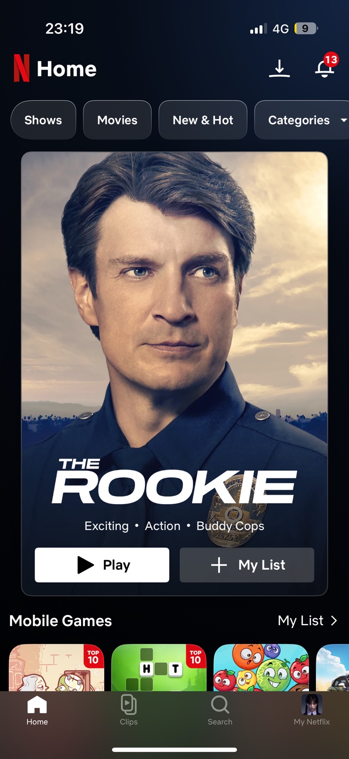
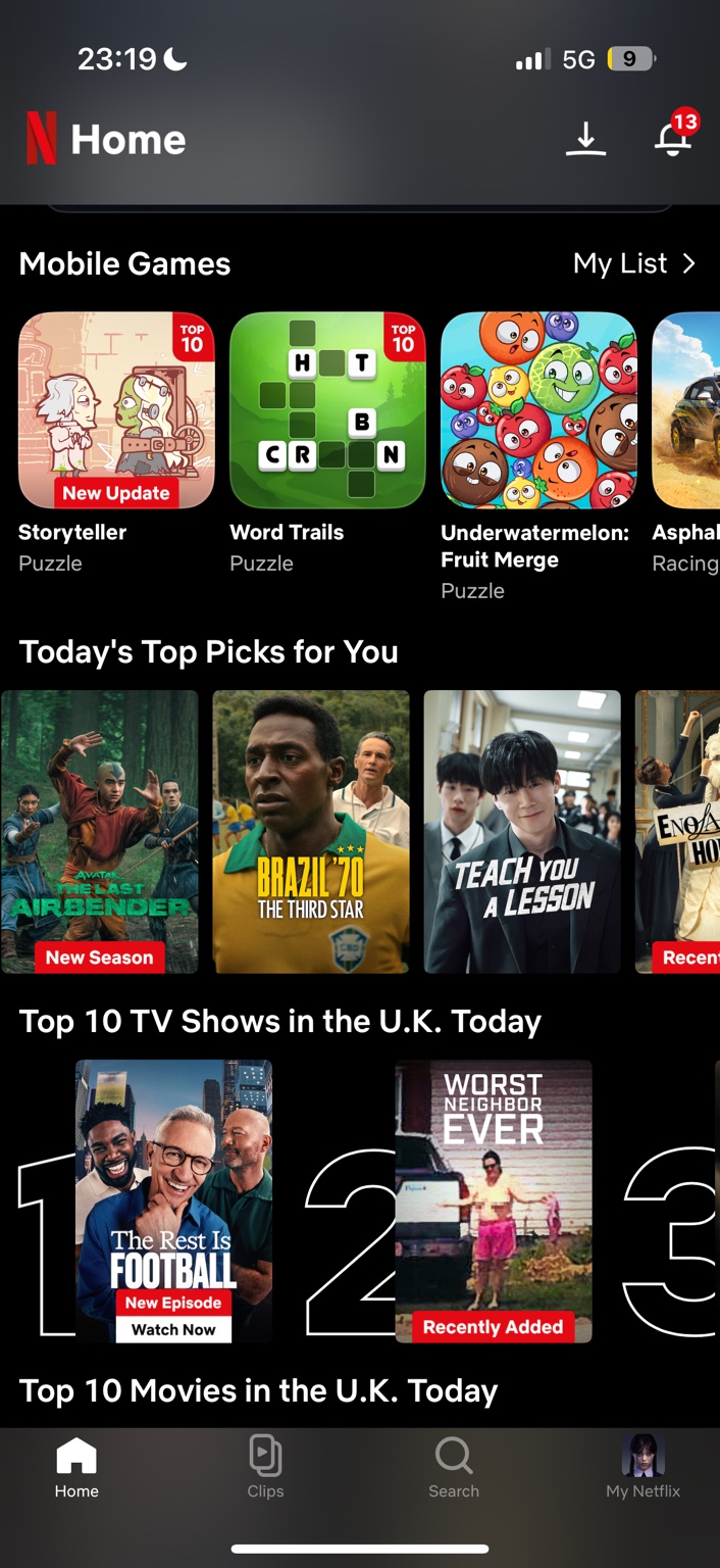
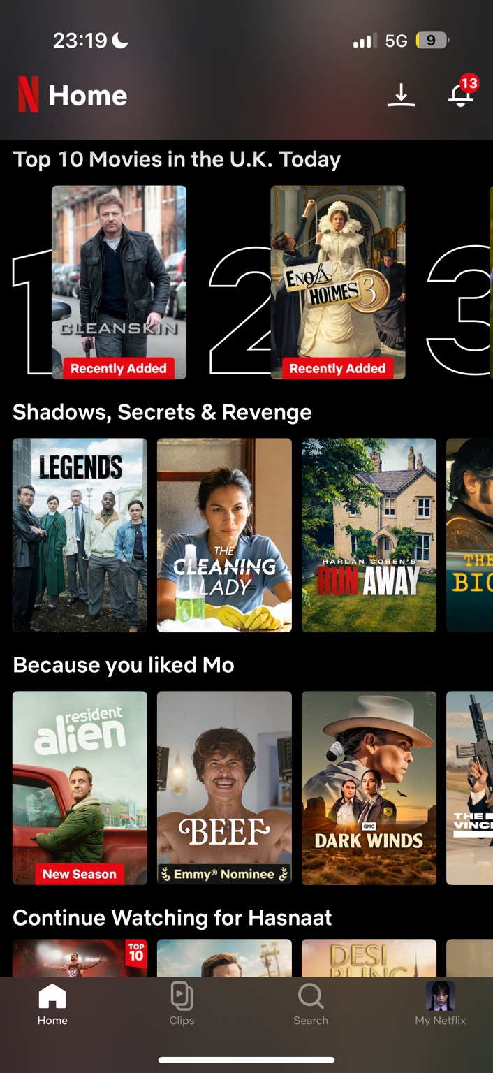
In my session, Netflix opened with The Rookie as the main card. I also saw the usual filters for Shows, Movies, New & Hot and Categories, plus downloads, a notification badge, Mobile Games, Today’s Top Picks for You, Top 10 TV Shows in the UK, Top 10 Movies in the UK, Shadows, Secrets & Revenge, Because you liked Mo, and Continue Watching for Hasnaat.
The app is not hard to use. That is not the issue. My issue is that Netflix mobile now feels like it is trying to do a lot at once: films, TV, games, clips, downloads, notifications, charts and personalised recommendations.
01 Quick Verdict
Netflix mobile is still easy to use, but the homepage feels busier than it needs to.
The basics are handled well. The Play button is obvious. My List is easy to find. Search sits in the bottom bar. The page opens with one big title card instead of throwing you straight into a wall of posters.
The busier feeling starts once you scroll. Netflix quickly becomes a mix of TV shows, films, games, Top 10 rows, clips, notifications, personalised shelves and continue-watching reminders.
I do not think the app is confusing. I just think it has lost a little of that old Netflix calm, where you opened the app and felt like you could pick something quickly.
My view: Netflix mobile is at its best when it gets you watching quickly. It is at its weakest when it makes you scroll through row after row, waiting for the “right” choice to appear.
02 My Netflix Mobile Screenshots
I took these screenshots on Netflix mobile for iOS on 9 July 2026, using Netflix app version 18.39.0. They do not show the whole homepage. They are just three points from the same session, showing the hero card, filters, Mobile Games, personalised rows, Top 10 shelves and Continue Watching.
03 First Impression: Familiar, Fast, Slightly Noisier
Netflix has one big advantage over almost every other streaming app: most people already know how it works.
The red N, black background, big title card and bottom navigation all feel familiar straight away. There is very little learning curve. You open the app, see a featured title, press Play or scroll.
On the homepage I checked, Netflix opened with The Rookie as the large card. Under it were the mood labels Exciting, Action and Buddy Cops, followed by two simple buttons: Play and My List.
That first screen works well. It is direct, clean and quick. The clutter creeps in later, not at the start.
04 The Hero Card Still Does the Job
The hero card is the cleanest part of the Netflix mobile homepage.
In my screenshot, The Rookie takes up most of the first screen. That makes sense on a phone. A mobile screen is small, so giving one title space to breathe is better than immediately showing a cramped grid.
The Play button is large, white and hard to miss. The My List button sits beside it. The category filters above it — Shows, Movies, New & Hot and Categories — are plain enough that nobody needs instructions.
This is the version of Netflix I like most: simple, direct and focused on watching.
What works
Big title card, clear genre labels, obvious Play button and quick My List access.
What feels weaker
The main card can feel more promotional than personal, depending on what Netflix chooses to push.
05 Mobile Games Make the Page Feel Less Focused
The clearest change from old Netflix is the Mobile Games row.
In my screenshot, games appear very high on the homepage, just under the main card. I could see Storyteller, Word Trails, Underwatermelon: Fruit Merge and a racing game card.
I understand why Netflix puts games there. They are included with the subscription, and Netflix clearly wants more people to know they exist.
But when I open Netflix, I am usually looking for a show or a film. Seeing mobile games so high up changes the mood of the app. It starts to feel less like a streaming app and more like a general entertainment shop.
I would not remove Netflix Games completely. I would just make that row more dependent on behaviour. If someone plays them, show them high. If they never touch them, push them lower.
06 Recommendations Are Useful Until They Become Endless
Netflix is still very good at making rows that are easy to scan.
I saw Today’s Top Picks for You, Shadows, Secrets & Revenge, Because you liked Mo and Continue Watching for Hasnaat. Each row has a purpose, and most people will understand them straight away.
The personalised rows help break the library into smaller shelves. Instead of one giant catalogue, Netflix gives you moods, trends, similar titles and things you already started.
That is useful, but it can also become tiring. After a while, every row starts to feel like another reason to keep scrolling. Netflix is good at helping you find something, but it is also good at making you wonder whether something better is one more swipe away.
07 The Top 10 Rows Are Still Useful
The Top 10 TV Shows in the UK Today and Top 10 Movies in the UK Today rows are among the most useful parts of the mobile homepage.
They answer a real question: what are people watching right now?
In my screenshots, the Top 10 rows use large number graphics behind the posters, with labels like New Episode, Recently Added and Watch Now. It is simple, readable and quick to understand.
I also like that Top 10 rows make Netflix feel a bit less isolated. Streaming can be too personalised sometimes. A national ranking gives you a small sense of shared viewing again.
The warning is obvious: popular does not always mean good. But as a browsing shortcut, Top 10 works.
09 These Screenshots Are Only Part of the Story
The three screenshots only capture part of the Netflix mobile homepage. The real page is longer and more changeable than these images can show.
During normal browsing, Netflix can show rows for new releases, recently added titles, Netflix originals, trending titles, saved items, unfinished shows, genre collections, seasonal picks, actor-based shelves and more “because you watched” recommendations.
That matters because Netflix mobile is not a fixed homepage in the old website sense. It behaves more like a live feed. It keeps rearranging itself around your viewing habits, current promotions and what is popular in your country.
It is personalised
Another user may not see the same hero title, Top Picks row or personalised recommendations. These screenshots show my version of Netflix mobile at the time I checked it.
It is promotional
Netflix is not just helping you find something. It is also pushing new seasons, popular titles, games, clips and features it wants more people to use.
It keeps going
The longer you scroll, the more rows appear. That can be helpful, but it can also make choosing something feel harder than it should.
10 What Netflix Mobile Gets Right
The Play button is still excellent
It sounds basic, but it matters. Netflix makes the main action obvious.
The page is easy to scan
Even when the page gets busy, the posters, labels and rows are easy to understand.
Top 10 is genuinely useful
It quickly shows what is popular in the UK without needing to search.
Continue Watching still matters
For everyday use, this row is probably more useful than most recommendation shelves.
11 What Annoys Me
My biggest issue is that Netflix mobile now has too many jobs.
It wants to be a film app, TV app, mobile games app, clips app, downloads hub, recommendation engine and popularity chart. Those features are not useless, but they do not all need to feel equally loud on the homepage.
The Mobile Games row is the clearest example. I do not hate it. I just do not think it should sit so high for users who never play Netflix games. The same goes for Clips. These features may matter to Netflix, but they will not matter equally to every viewer.
I also think some rows blur together after a while. Top Picks, genre rows, personalised rows and “because you liked” rows all make sense separately, but the more you scroll, the more they start to feel like variations of the same idea.
That is where Netflix loses a bit of charm. It is still easy to use, but it is not always relaxing to browse.
12 Final Verdict
Homepage score: 8/10
Netflix mobile remains easy to use, but games, clips, Top 10 rows, notifications and endless recommendations make it feel more crowded than before.
I still like the Netflix mobile homepage. It is fast, familiar and easy to understand. The Play button is clear, the filters make sense, Search is easy to reach and Continue Watching is still useful.
But it does not feel like a simple film-and-TV app anymore. It feels like a full entertainment hub, and that comes with extra noise.
My screenshots only show part of the experience. Netflix mobile goes far beyond the hero card, games, Top 10 rows and Continue Watching. The page keeps building more rows as you scroll, which is useful when you want ideas but tiring when you just want to choose quickly.
My ideal version would keep the hero card, Continue Watching and Top 10 rows high up, but move games and clips lower unless I actually use them.
Netflix mobile is still simple to use. I just wish it trusted that simplicity more often.
13 Frequently Asked Questions