
HBO Max Mobile Homepage Review:
Easy to Use or Too Cluttered?
I tested the HBO Max mobile homepage on 9 July 2026 to see whether it feels clean and premium, or too busy on a phone screen.

HBO Max mobile looks premium, but it gets busy quickly
I checked the HBO Max mobile homepage on 9 July 2026. The two screenshots in this article are from that same test session, so this is a mobile-first look at the app rather than a general desktop homepage review.
My first impression was good. The dark background, large hero artwork and clean HBO Max branding all feel premium on a phone. But once I started scrolling, the homepage became busier: featured rows, big HBO titles, recommendations, live sports, “Get Access” buttons and unavailable-plan messages all appeared close together.
The mobile app is not hard to use. The issue is that the homepage sometimes feels like it is trying to be a TV app, sports hub and upgrade prompt at the same time.
01 Quick Verdict
The HBO Max mobile homepage is easy to move around, but it feels too crowded in places.
I like the look of it. The app feels darker, cleaner and more premium than a lot of streaming apps. The posters are large enough to read on mobile, the main tabs are clear, and the bottom navigation is easy to understand.
The weaker part is the mix. On a phone screen, there is not much space. When HBO Max shows featured titles, HBO drama recommendations, live sports, “Get Access” labels and unavailable-plan warnings close together, the homepage starts to feel less calm.
My verdict: HBO Max mobile looks premium, but the homepage would feel better if it separated included content, locked content and live sports more clearly.
02 My HBO Max Mobile Screenshots
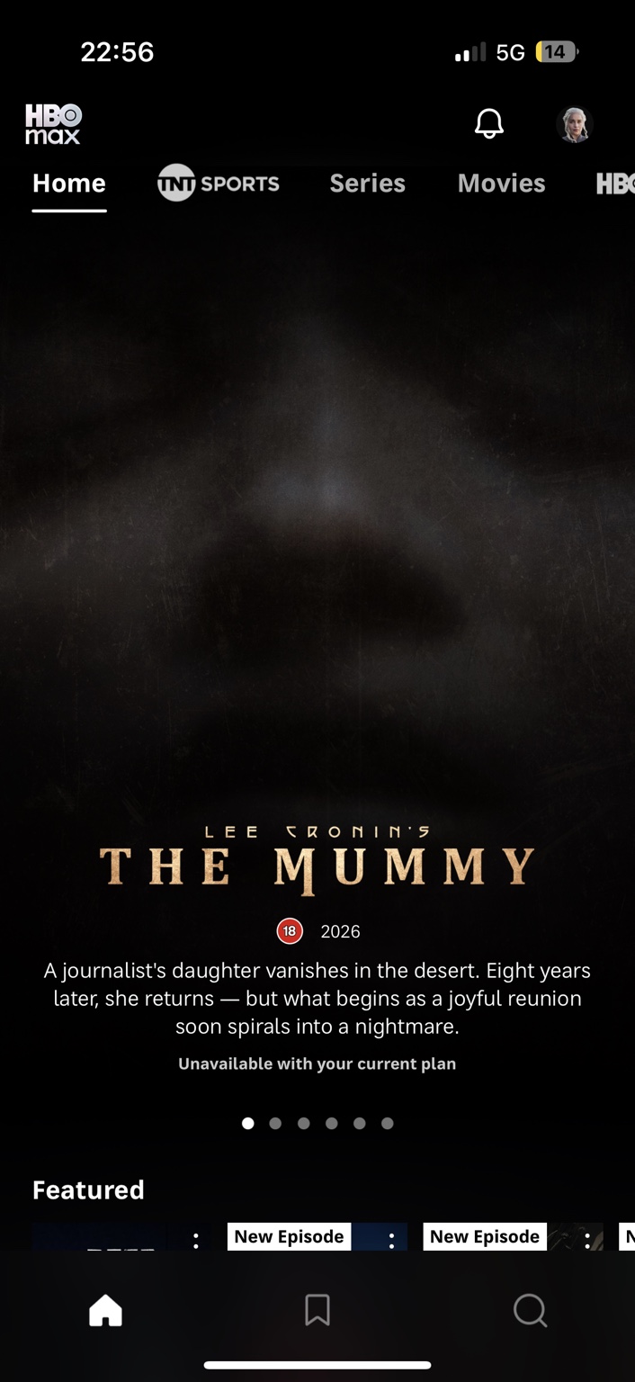
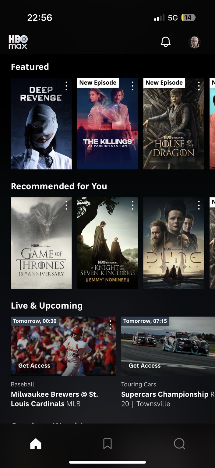
I took these HBO Max mobile screenshots on the same day as the test: 9 July 2026. They do not show every part of the app, but they show the main things I noticed: the hero area, featured rows, recommendations, live sports cards, “Get Access” prompts and unavailable-plan messaging.
03 First Impression: It Looks Premium on Mobile
The first thing HBO Max gets right is the mood.
The black background, large artwork and clean logo make the mobile app feel polished. It does not look cheap, and the big posters help because phone screens need strong visual hierarchy.
In my screenshot, the hero area promotes The Mummy, but the app also shows that it is unavailable with the current plan. That is where the homepage shows its biggest strength and weakness at the same time.
Visually, the page looks dramatic. As a user, though, being shown something you cannot watch straight away makes the app feel less friendly.
05 The Mobile Homepage Rows Are Useful, But Busy
The Featured row works in a normal streaming-app way. It shows big posters, promoted titles and new episode labels. In my mobile screenshot, I could see titles such as Deep Revenge, The Killings at Parrish Station and House of the Dragon.
The Recommended for You row leans into major HBO brands. I saw titles connected to the Game of Thrones world, including A Knight of the Seven Kingdoms, plus other big HBO-style recommendations.
None of that is wrong. It makes sense for HBO Max to show off its strongest titles. But on mobile, these rows can start to feel stacked very quickly. You do not get the breathing room of a TV screen or desktop layout.
That is why the homepage feels useful and crowded at the same time.
06 Locked Content Is the Most Frustrating Part
The most annoying part of the HBO Max mobile homepage is not the design. It is seeing content that looks promoted, but is not actually available with the current plan.
A large “Unavailable with your current plan” message changes the feel of the app immediately. Instead of browsing a library, it starts to feel like you are being shown what you are missing.
I understand why HBO Max does this. It wants to show the wider platform, including content tied to different plans or add-ons. But on mobile, that kind of message feels even more intrusive because the screen is already small.
A mobile streaming homepage should quickly answer: “What can I watch right now?” HBO Max sometimes makes you think: “What do I need to upgrade to watch this?”
07 Live Sports Make the Homepage Feel Broader
The Live & Upcoming row makes HBO Max feel less like a pure TV-and-film app and more like a wider entertainment bundle.
In the mobile screenshot, I could see sports cards with “Get Access” labels. If you care about live sport, that may be useful. If you opened the app to watch a series or film, it adds another thing to process.
This is not automatically bad. Sports are becoming a bigger part of streaming, and some users will like having them in the same app.
But for the homepage, it makes HBO Max feel less focused. HBO has a strong premium-TV identity. Sports rows and access prompts push the app closer to a modern cable-style bundle.
08 What HBO Max Mobile Gets Right
The app looks premium
The dark design, large posters and HBO branding work well on a phone screen.
The rows are easy to understand
Featured, Recommended for You and Live & Upcoming are clear labels.
The HBO library still feels strong
Big HBO titles make the app feel more premium than many streaming homepages.
Search and saved content are easy to reach
The bottom navigation keeps the basics simple on mobile.
09 What Annoys Me
My main complaint is that HBO Max mobile does not always feel confident about what the homepage should prioritise.
Is it showing me what I can watch? Is it pushing HBO originals? Is it selling live sports? Is it showing me titles outside my plan? At times, the answer feels like all of those things at once.
That creates friction. Not enough to make the app unusable, but enough to make it feel busier than it should.
The small three-dot menus, labels, badges and access prompts also add to the mobile clutter. They are useful individually, but together they make the homepage feel less clean.
HBO Max has the content to feel premium. The mobile homepage just needs to trust that content more and separate the sales prompts more clearly.
10 Final Verdict
Mobile homepage score: 7/10
HBO Max mobile looks premium and is easy to navigate, but it becomes cluttered when recommendations, locked content, live sport and access prompts appear together.
I would not call the HBO Max mobile homepage bad. It looks polished, it is simple enough to move around, and the HBO branding gives it a stronger identity than many streaming apps.
I just do not think it feels effortless. On a phone, space is limited, and HBO Max uses that space to show a lot: premium dramas, live sports, locked content, recommendations and upgrade-style prompts.
For me, the best version of HBO Max mobile would separate these more clearly. Put included shows and films first, keep sports in its own cleaner area, and make locked content feel less like part of the normal browsing experience.
Right now, HBO Max mobile is easy to use, but slightly too cluttered to feel calm.
11 Frequently Asked Questions